I had a chance to read the incredible book, ‘Bayesian Statistics The Fun Way,’ during the Corona lockdown. I was amazed by the process of calculating the posterior probability based on the prior and newly acquired information and repeating this process by putting the posterior as the prior input of the next step. It resembles what we would normally do when watching sports games on TV or eSports streaming on Twitch. We adjust the winning probability of the team as they hunted a dragon or getting killed by opponents. To visit the prediction app, click here. The related repo can be found at this link.
Enter the League of Legends
League of Legends is a multiplayer online battle game developed by Riot Games, which is a de-facto national sport in South Korea(just kidding but seriously in a way). There are multiple regional leagues around the globe competing with the world championship. Each game is a battle in the arena between two teams, Blue and Red, and a gamer is conducting a role within a team. So, the game result can be a dichotomous classification. And each game is full of exciting sub-events – placing of stealth wards, killing elite monsters, gaining Gold/Exp, and which team made the first kill. These are useful candidate features for continuous outcome prediction with Bayesian thinking. If you are not familiar with the game, watch the gameplay of ‘Faker’ from T1, one of the top class professional LoL sports teams.
Diamond Ranked Dataset
I could get the diamond ranking game data from Kaggle. The dataset includes features for the first 10 minutes of each gameplay and the result. I was intrigued by predicting an outcome with the prelude of a game. The readers can get different data by directly using an API provided by Riot Games.
- blueKills, redKills – The kills made by each team. A direct metric of how good the team is
- blueFirstBlood, redFirstBlood – Which team made the first kill. Yes, we gotta start on the right foot!
- blueDeath, redDeath – Just the flipped variables of the previous ones
- blueAssits, redAssits – Attacks from players of each team, which did not lead to final dealing. In a way, these features are representing the team collaboration
- blueAvgLevel, redAvgLevel – Average level of champions per each team
- blueExp, redExp, blueGold, redGold – Experience stat and Gold gained by each team.
- blueDragons, blueHeralds, blueEliteMonsters, redDragons, redHeralds, redEliteMonsters – How many Dragons and Heralds were killed by a team. Each count can be a good predictor of wins since they are powerful, elite monsters in games
- blueTotalMinionsKilled, blueJungleMinionsKilled, redTotalMinionsKilled, redJungleMinionsKilled – kill count of miscellaneous monsters
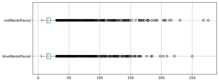
- blueWardsPlaced, blueWardsDestroyed, redWardsPlaced, redWardsDestroyed – Wards are one of the deployable units to get different benefits. So the number of placements or destructions are representing active or dominant gameplay in the first 10 minutes
- blueTowersDestroyed, redTowersDestroyed – The number of opponent turrets destroyed by each team. Also a useful index of the aggressive unfolding of a game
- Comparative or aggregational features – Variables such as the difference of Gold amount between teams(redGoldDiff) or how many monsters were killed per minute(blueCSPerMin)
Ideas for Preprocessing
When checking out the histogram of each feature, I found that many quantitative variables show a moderate bell-shaped curve. So, going with Gaussian Naïve Bayesian is not a bad idea.

Wards-related variables showed skewed distribution. But considering the median value of wards placements are around 16, I would try binning and capping those variables to make them into categorical variables.
As we can see from the above, some variables are direct linear combinations of other variables. For instance, the number of Kills by Blue team is technically the same as the number of Deaths by the Red team. And it is natural that golds, kills, experience, or level would be correlated as winning teams would show gain higher points. Take a look at a higher correlation between ‘redTotalGold’ and ‘blueDeaths(kills by Red)’ or ‘redGoldPerMin’ and ‘blueDeaths’ from the correlation plot. Those squares glow in crimson color (Pearson’s R > 0.85)
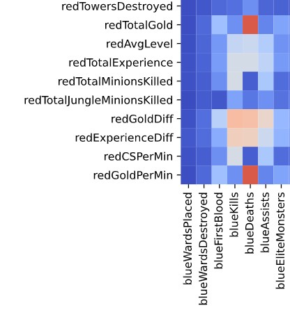
Thus, I removed apparent flip-side variables and linear combinations(# of Elite Monster Kills) to reduce multi-collinearity. For other highly-correlated couples, Aggregated variables were removed over authentic ones. For instance, ‘blueKills’ is selected over ‘blueGoldPerMin’. As a result, we now have 25 features to go.
Prediction Performance
To measure the performance of prediction, I decided to set aside 20% of data for testing and compare the metric to spot-check results from Random Forest. The accuracy of the Naive Bayesian classifier was around 0.73 with the train set and 0.71 when applied onto the test set. The figures are aligned with the baseline performance from Random Forest, and similar to prediction works from fellow League of Legend fans. So I decided not to pursue any further to increase the accuracy or f1-score metric. And it is in a way satisfying that a team can come from behind and win even though they messed up the first ten minutes.
Naïve Bayesian – accuracy (train): 0.7269 (std 0.0046)
Random Forest – accuracy (train): 0.7215 (std 0.0098)
| Precision | Recall | F1-Score | |
| Red Win | 0.71 | 0.72 | 0.71 |
| Blue Win | 0.71 | 0.70 | 0.71 |
| Accuracy | 0.71 |
Service the ML Model as API
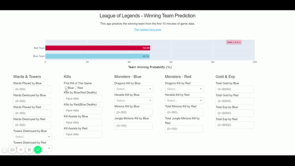
To simulate the cycle of priors to new data to posterior to winning probability prediction, I imagined a Web-based dashboard that shows initial probabilities of wins(prior, 50% to 50%) and provides input forms to get the changing game data.
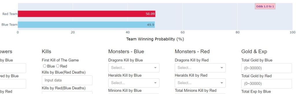
The Dash framework from Plotly provides a solution for this scenario. By creating a Dash app, I could prepare a presentation layer(Dash layout) that interacts with a back-end machine learning servicing layer. Gaussian Naive Bayesian results from the previous training can be loaded in the Dash call back function to make predictions for new data inputs.

The Custom Prediction Function
The caveat with this approach is preparing a custom Gaussian NB prediction function that can handle the absence of certain features. Since the naive_bayes module from Scikit Learn is not supporting such missing feature handling as of v0.22.1, I decided to create one with the following approach
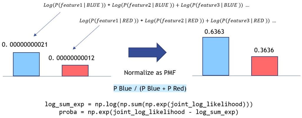
- Firstly, Creating a joint probability of the priors and the probabilities of each feature per class
- As a next step, I would add a data processing wrapper that skips if a feature is absent, and normalize the result to get class prediction probability between 0 and 1
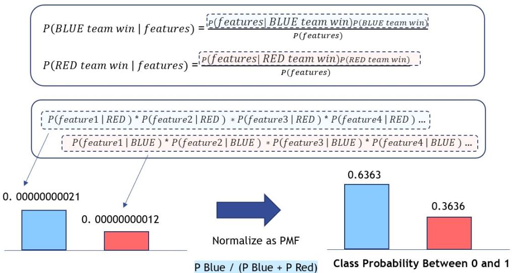
- Lastly, apply logarithm and log-sum-exp trick to avoid underflow when multiplying or dividing tiny numbers in Python
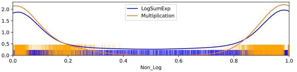
The prevention of underflow is essential when dealing with probabilistic models. The multiplication of small numbers can result in a much smaller number that flows over the precision point of python variables, thus lead to incorrect or unexpected outcomes. For instance, let’s compare the implementation of Naive Bayes with Logarithm/Log-Sum-Exp to that of ‘naive’ joint probability implementation.

If we don’t take the logarithm approach, joint probabilities would be calculated as multiplication, which is prone to underflow. The odds of wins can be exaggerated due to rounding or whatever uncertainties within. As we can see below, the winning probabilities of the Blue team are more extreme due to the underflow.
Deploying the Prediction App
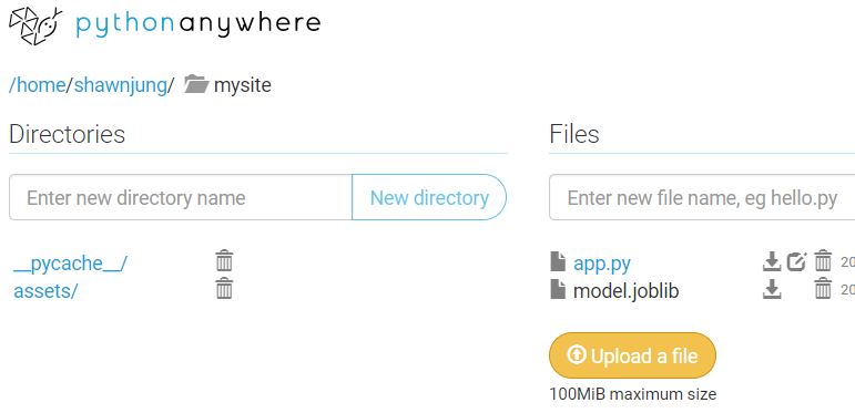
Now it is time to deploy the Prediction app to a server. If this is a work-related mission-critical application, we would create a Docker image and run this on AWS ECS or deploy with GCP App Engine. But I will go smooth with Python Anywhere for this weekend project. They provide convenient, hassle-free Python web app deployment service, and it works like a charm.
Finally, the app is now up and running here – http://shawnjung.pythonanywhere.com/ We can see the game outcome prediction is changing as we add up the game data!
Reference
- Tricks of the trade: LogSumExp
https://blog.feedly.com/tricks-of-the-trade-logsumexp/ - Diamond-Ranked Game Data from Kaggle
https://www.kaggle.com/bobbyscience/league-of-legends-diamond-ranked-games-10-min - Naive Bayes Implementation from Scikit Learn
https://github.com/scikit-learn/scikit-learn/blob/master/sklearn/naive_bayes.py - NB Classifier From Scratch in Python by Jason Brownlee
https://machinelearningmastery.com/naive-bayes-classifier-scratch-python/ - League of Legends FANDOM wiki
https://leagueoflegends.fandom.com/wiki/League_of_Legends_Wiki - A machine learning framework for sport result prediction by Rory Bunker and Fadi Thabtah
https://www.sciencedirect.com/science/article/pii/S2210832717301485 - Match Prediction of LoL Using Vanilla Deep Neural Network
https://towardsdatascience.com/match-prediction-in-league-of-legends-using-vanilla-deep-neural-network-7cadc6fce7dd - League of Legends Win Predictor by Thomas, David, and Gregory
https://thomasythuang.github.io/League-Predictor/ - How Does eSports Betting Compare With Sportsbook Wagering by Jamie Casey
https://www.gambling.com/news/how-does-esports-betting-compare-with-sportsbook-wagering-2232800
